Case Study
ROKU Registration Journey
Devices
📺 ROKU Streaming Device
Role
UX/UI Designer
Timeline
2 Sprint

Overview
UKTV Play can be accessed on multiple platforms, including ROKU. In order to have a well-rounded application, it is considered a best practice to create an adaptable application that can cater to the specific product specifications of different devices. Unfortunately, one aspect that was not included in the main designs of UKTV Play rebrand is the on-device sign in /registration journey with a screen keypad. When approaching this project, I followed the double diamond process to develop a user-friendly experience.
The Problem Statement
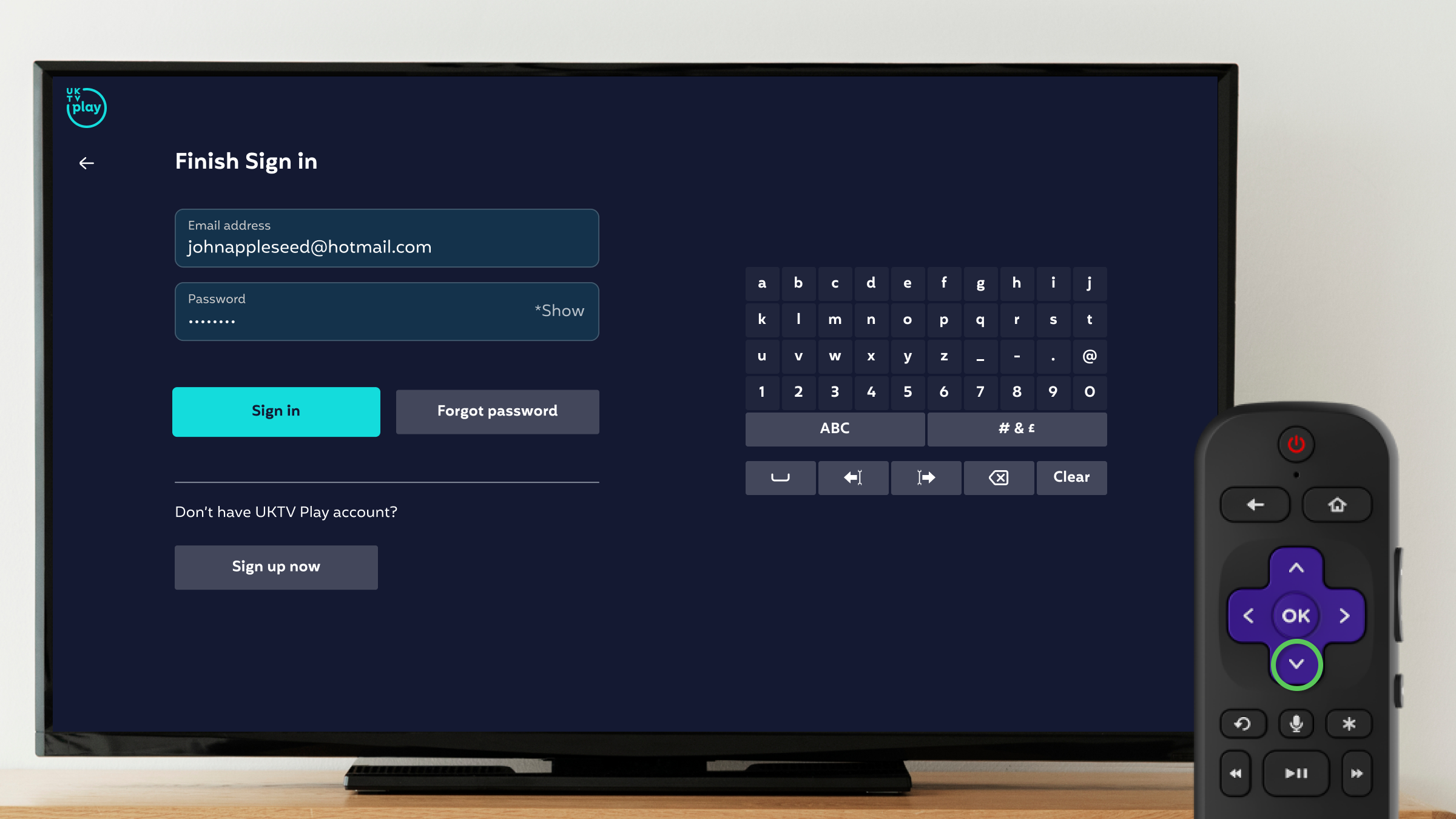
As a user I want to sign in or register on my ROKU device using the screen keypad, so that I can start/continue watching content on UKTV Play.
Deliverables
In order to design the optimal experience, the sign-in/registration journey needed to meet certain acceptance criteria. Some of these criteria include the inclusion of an RFI screen (Roku's request for information pop-up) where the user can consent to their credentials being used to create an account on UKTV Play. This screen allows Roku to pre-populate fields after the user gives consent on the RFI screen. The challenge in this situation was that I had to design for multiple scenarios while ensuring a smooth experience for the users.
“Work expands so as to fill the time available for its completion.”
Discovery
Secondary Research
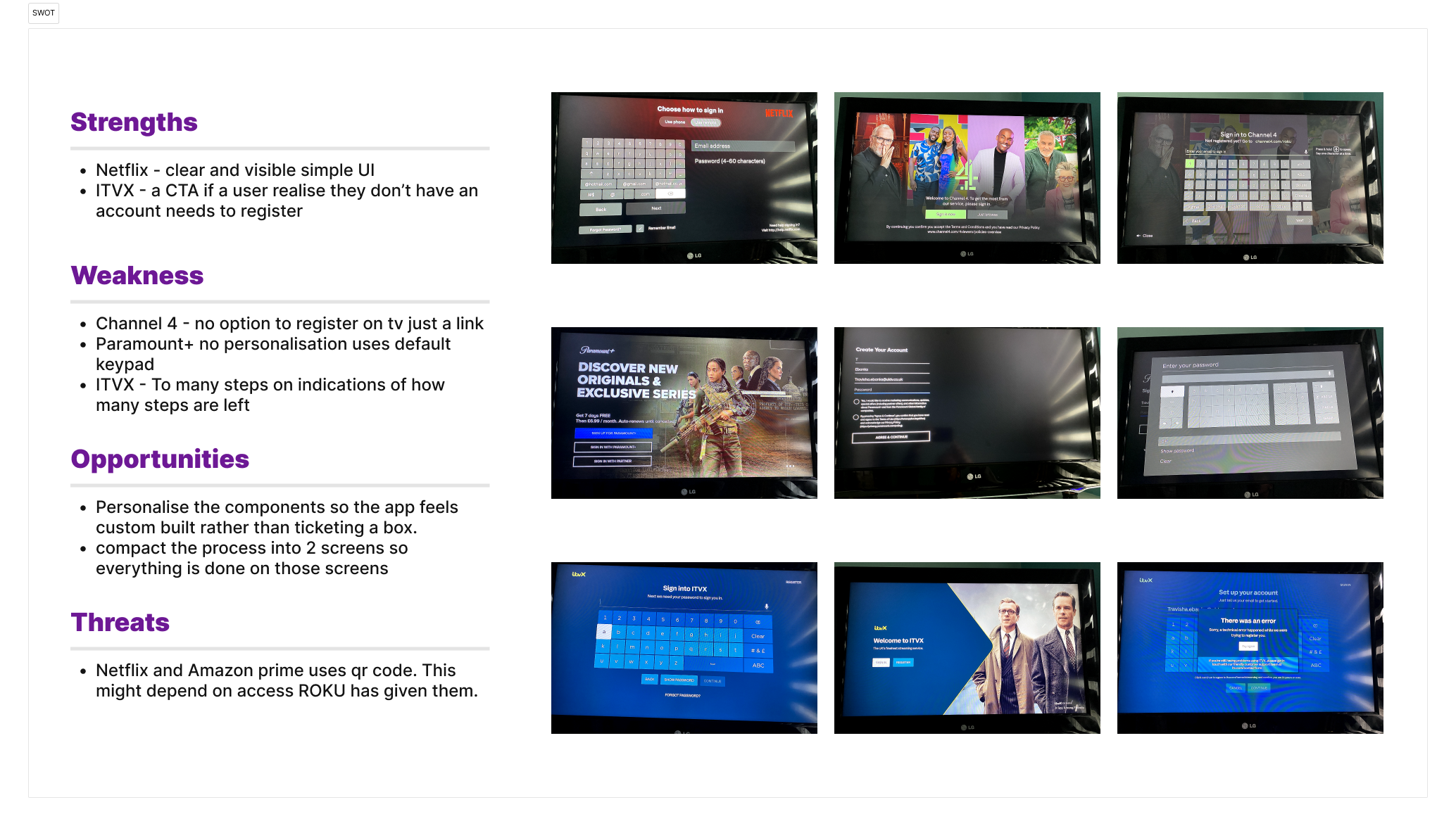
To kick off project I looked competitors to see their approach and conducted a SWOT analysis.
From this analysis, I noticed that if a user chooses to use a remote to sign in/register, they will already know that it will take time and may not be as inconvenient because they are expecting it. However, I thought about the goal-gradient effect, which explains how people are motivated by knowing how close they are to a target. So, I decided to incorporate the approach of including steps in the registration process to alleviate user expectations, which I found competitors did not include in their user journeys.
Primary Research
As an advocate for ensuring consistency across all platforms for UKTV Play. I have taken the sign-in and registration process on the web into consideration and repurposed these designs, incorporating the opportunities discovered from the SWOT analysis, in order to brainstorm potential UI enhancements and establish a user flow for this journey.
Define
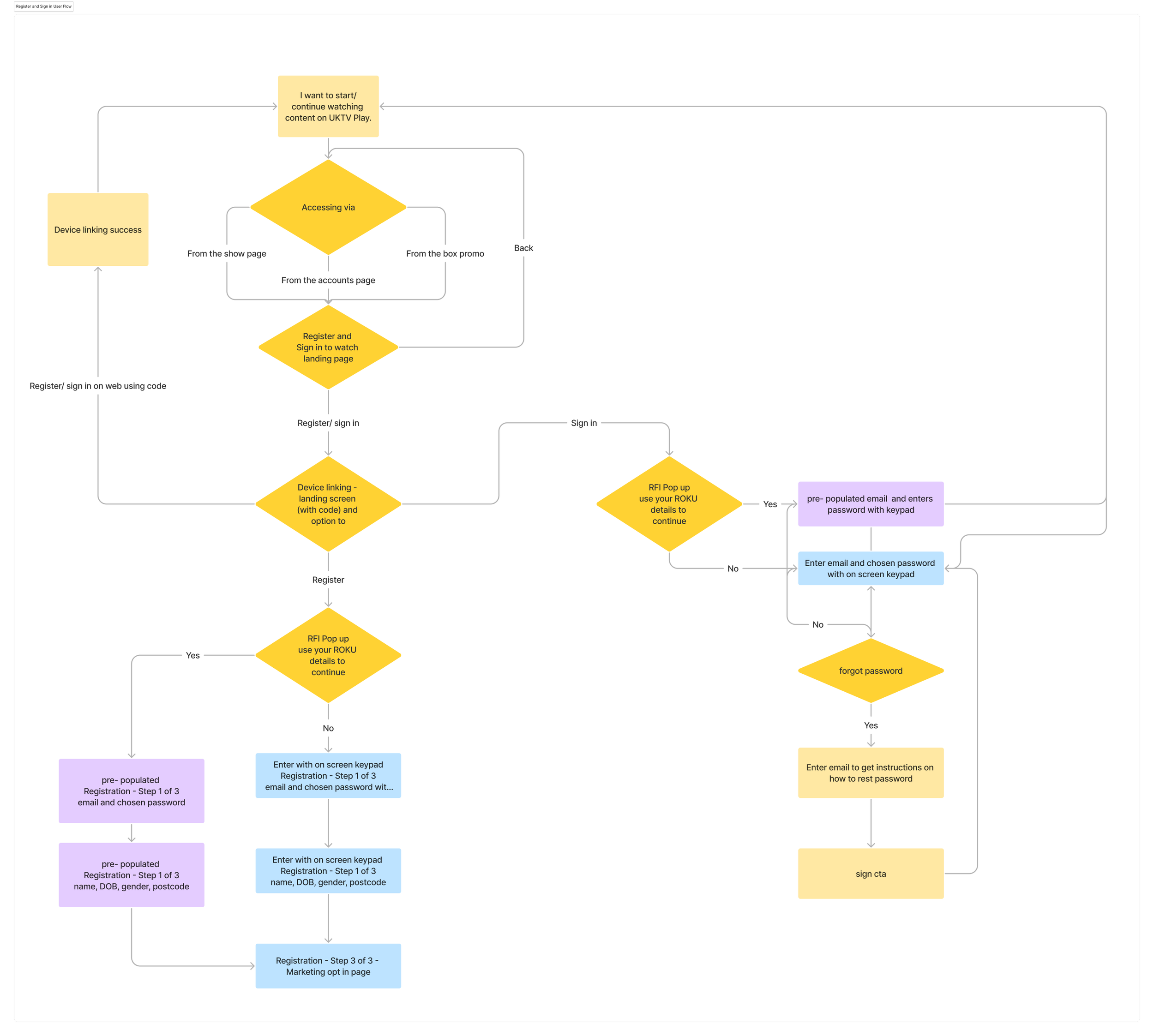
After reviewing and analysing my findings, I collaborated closely with the product owner to establish and solidify the various journeys, these were:
The user uses the authentication code and completes the process on the web.
Pre-populated screen using RFI for signing and registration.
The user chooses to enter the information manually for signing and registration.
Feedback sessions with ROKU developers led to adjustments in the flow and design. One change made was excluding the reset password journey on the TV device because it was inefficient. Instead of having the user navigate back and forth, I implemented a method similar to our competitors. Instead a users receive a reset password link in their email and complete the process on their web browser before returning to the TV sign-in page. By adopting this method, users who choose to sign in at a later time after resetting their password will be able to proceed directly to the sign-in step without repeating the entire process, as the process was already completed on the web.
Development
Throughout the development phase, I carefully took into account the constraints of a TV screen and the reliance on a remote control. My objective was to create components that seamlessly integrated with the design system of UKTV Play. For instance, I contemplated how these components would appear from a distance while considering the user's perspective.
Delivery
To summarise, incorporating features such as RFI authentication, device linking, and manual remote sign-in/registering was very complicated. As a human-centric focused designer, I had the urge to simplify the entire user journey to one screen. However, in reality, we have constraints, so I figured out how they could interlink to minimise user frustration and provide clear pathways for the user.


