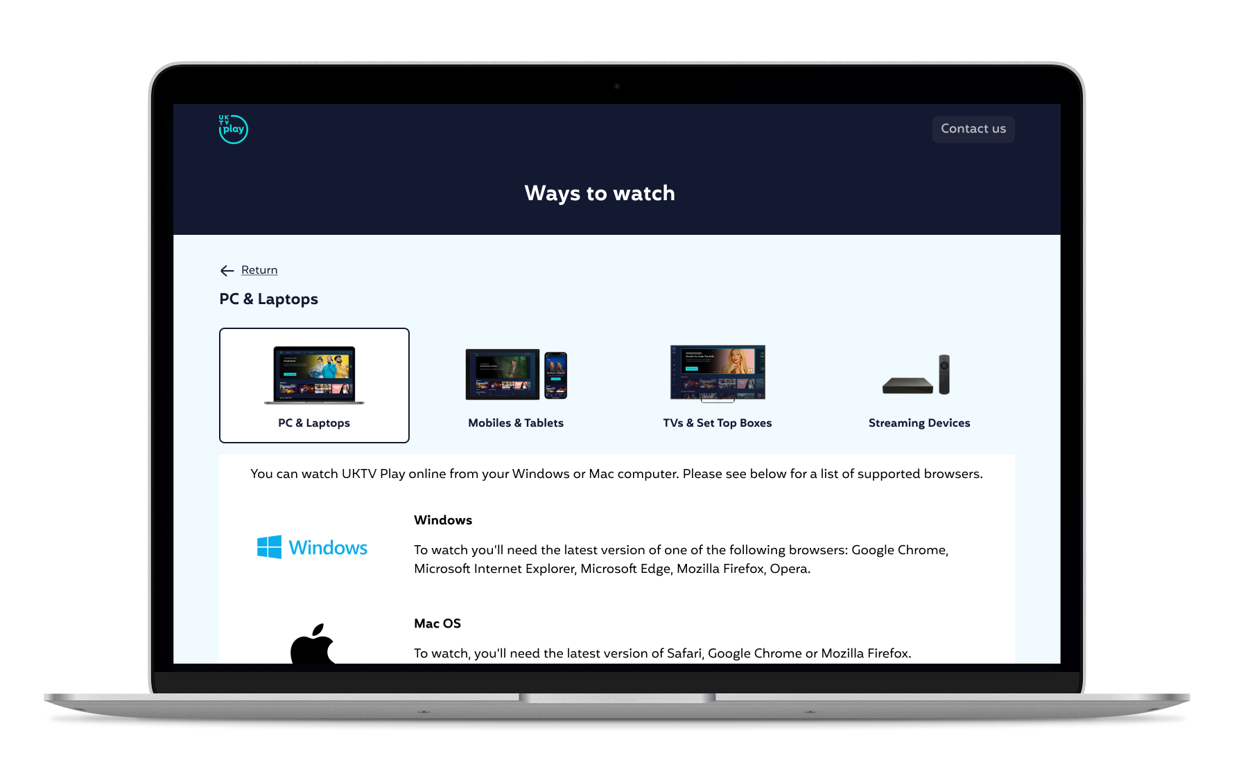
Case Study
UKTV Play’s Help Page Rebrand
Devices
💻 Web Browser
Role
UX/UI Designer
Timeline
2 Sprint
Overview
As part of UKTV Play’s rebrand, the objective was to enhance the platform's overall structure, making it more user-focused and relevant. One of the resulting decisions was to change how users access and use the help page. This change meant leveraging the existing mental modes of users and understanding how they typically seek information.
“Users spend most of their time on other sites. This means that users prefer your site to work the same way as all the other sites they already know.”
The Problem Statement
Users are experiencing difficulty in locating relevant information and solutions for their technical and account-related issues, resulting in feelings of frustration. This frustration stems from the absence of a dedicated pages where users can easily access the necessary information.
My Approach
User-Centric: Create a visually pleasing site that reduces fiction and putting the users needs first when making decision on the composition of visual elements.
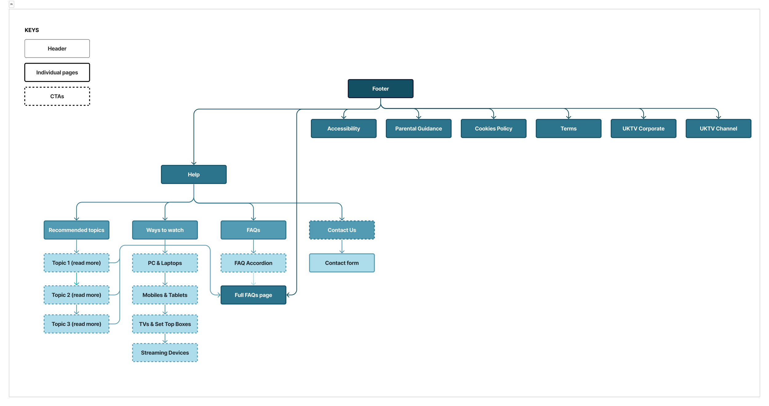
Information Architecture: Categorise information based on users' mental models and prioritise frequently asked questions. Ensure easy navigation and quick access to relevant sections.
Feedback: Include contact us call-to-action on each page to provide users with a convenient way to reach out.
Interactive Elements: Utilise Interactive elements, such as an accordion feature and tabs. This will allow users to view all the information at once without feeling overwhelmed.
Understanding the users
Persona
Golden Traditionalist
This demographic represents a significant portion of internet users, many of whom may not be as tech-savvy as younger generations. They are likely to have specific preferences and requirements when seeking help. They may prefer clear and concise instructions, larger fonts, and simple navigation.
Goals and Motivations
Most users have a second device to-hand in the form of a mobile, tablet to look things up on. They may also have an additional TV in the kitchen.
The TV is on most of the day - these users show a propensity towards putting something on in the background during the day. This is often familiar shows they've seen before.
Pains and Frustration
These users are most likely to shy away from suspicious providers with unclear details around fees for the service.
Device linking is popular with these users - however, they feel the UKTV Play offering is not to the standard of other providers. They expect the instructions to be clear, with an obvious place to enter the code on the UKTV website.
Journey Mapping
In order to address the specific needs of this demographic and account for the diverse range of devices and platforms available for consuming video content, It is evidently important that one of the business goals is to optimise the supportive resources accessible for users. This will enhance their experience they have with UKTV Play and ultimately contribute to a positive user experience and brand loyalty.
Information Architecture
Hypothesis
We believe that making help easily accessible for the Golden Traditionalist we will address user inquiries and build trust. We will know this to be true when we see the frequency of queries on simple issues reduce by 50%.
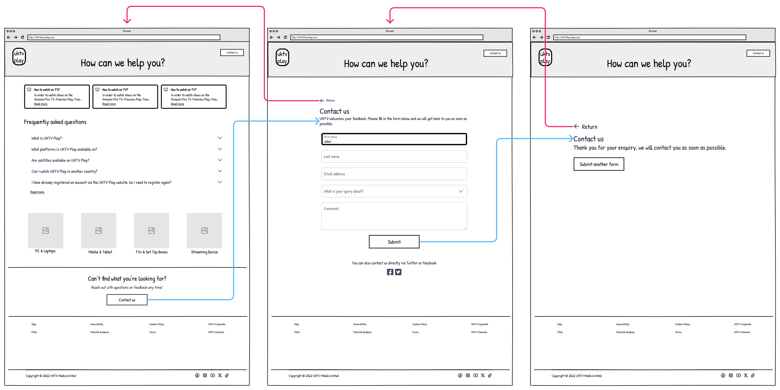
Wireframe
In this development phase of creating the visual design of the help page, I made a few decisions that contributed to achieving the hypothesis. These were as follows:
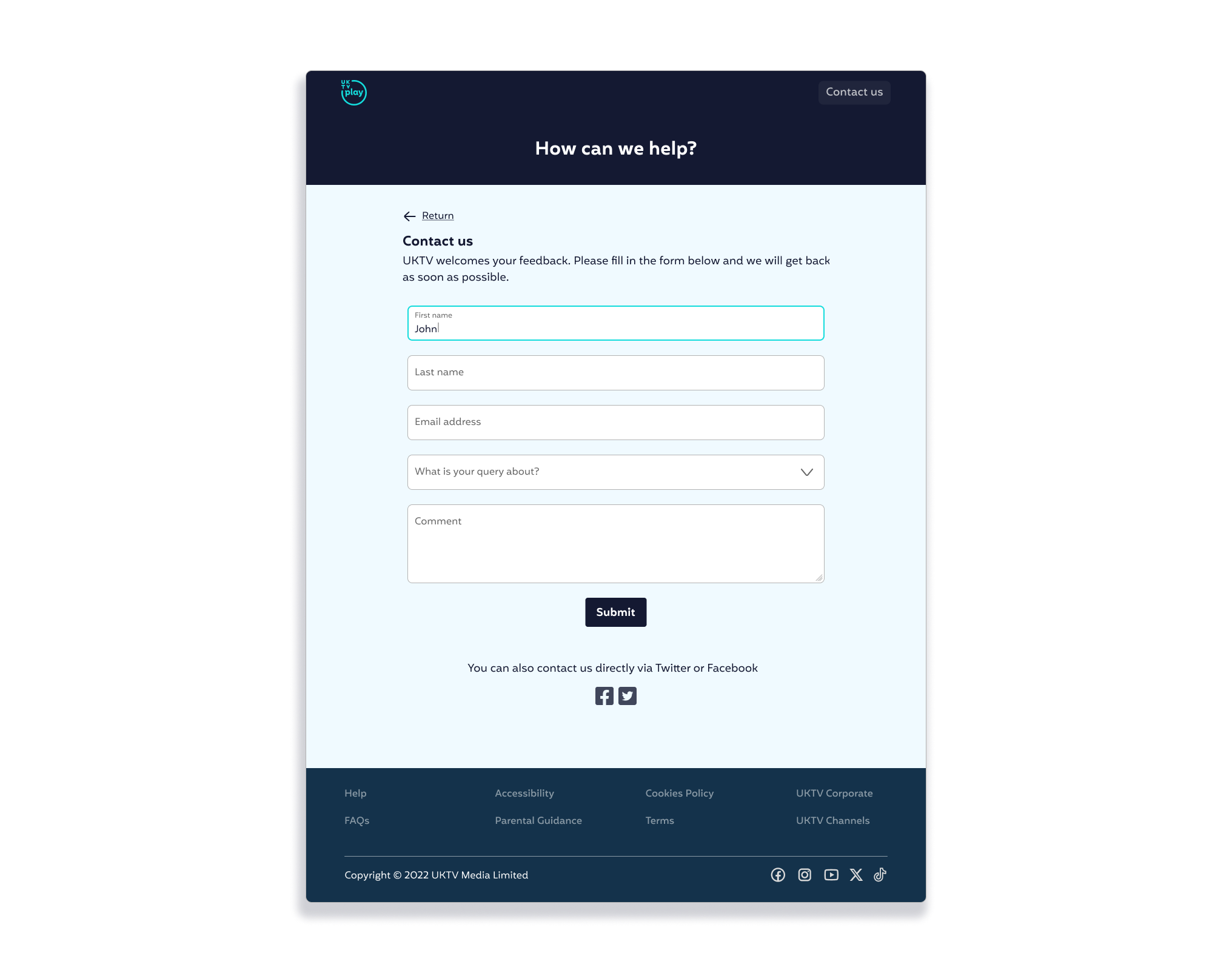
Allow users to easily go back to the previous page, I chose to incorporate a "Return" call-to-action to signify the ability to backtrack or navigate to the previous page while browsing a current page. This puts them in control of their navigation experience and instills a sense of trust and confidence in users, as they know they can easily explore different sections without the fear of getting lost or struggling to find their way back, which is particularly important for The Golden Traditionalist.
Placing a clearly visible "Contact Us" call-to-action at the bottom and top of page meets the users expectations that we value feedback and also creating a intuitive user experience.
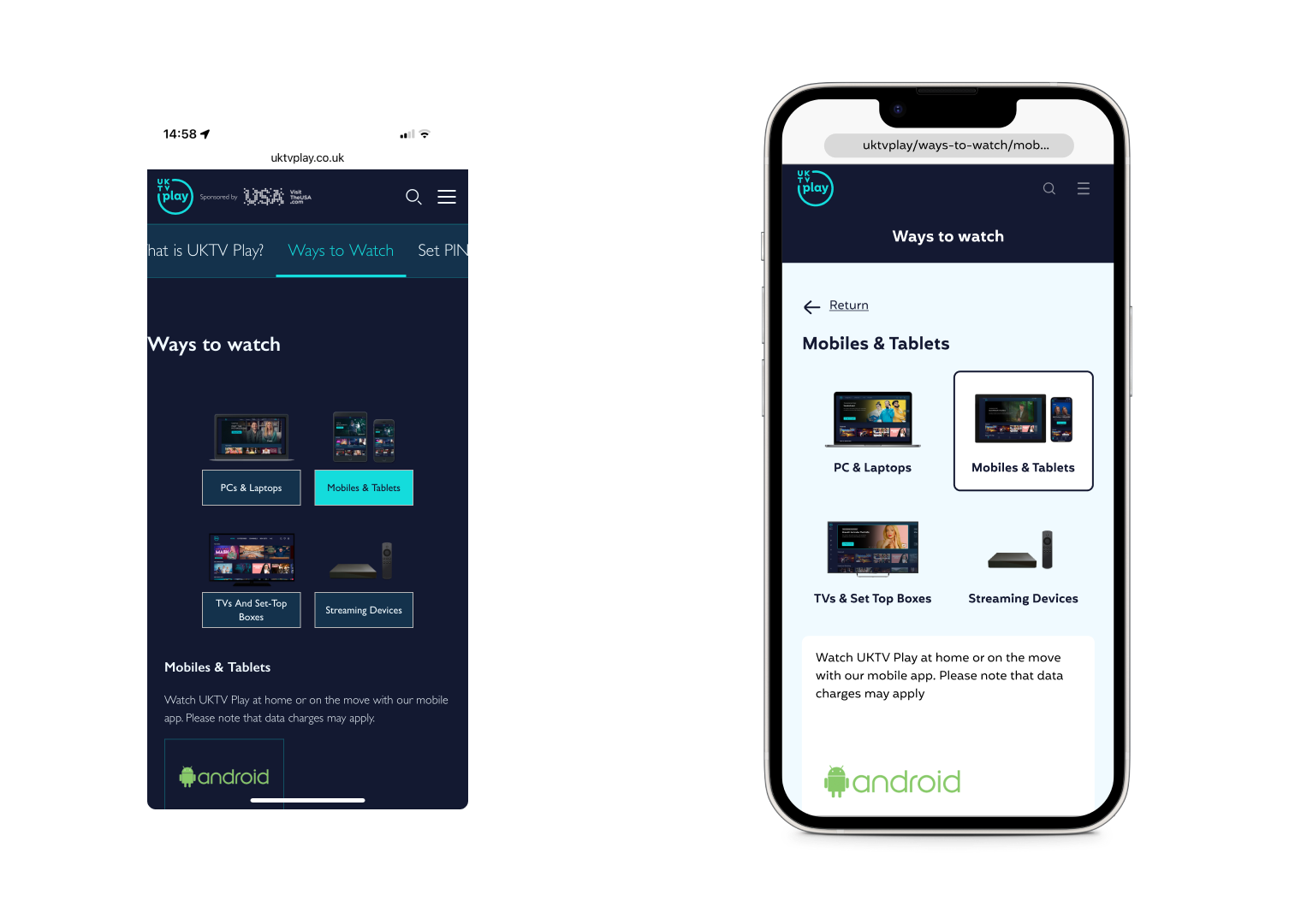
I changed the dark colour palette to light for a more inviting and accessible experience. I organised content with accordion drop-downs for a tidy layout and added quick links for easy access to popular information.
These adjustments aim to create a user-friendly and visually appealing interface to address user frustrations which were found in the earlier phases of this project.
Low fidelity wireframes
Accordion component for the different breakpoints
“When affordances are taken advantage of, the user knows what to do just by looking: no picture, label, or instruction needed.”
Prototype
Before and after
