Case Study
Revised EPG TV Guide
Devices
💻 Web Browser
Role
UX/UI Designer
Timeline
3 Sprints
Overview
UKTV intended to switch off their free-to-air channel sites by August 2022. As a result, content had to be redirected to either UKTV Play or the corporate site. But, this imposed behavioural changes for the channel site users. One of the features being the TV Guide.
The Brief
Simplify the existing UKTV Play TV guide to ensure both users redirected from channel site TV guides and existing users of the UKTV Play TV guide can confidently use the revised channel guide.
It is critical that we minimise loss of users when we turn off the channel sites as much as is possible.
Problem Statement
As a UKTV Play channel site user I want to feel comfortable using the UKTV Play TV Guide after the free-to-air channel sites are turned off. So that users can still find out when my favourite shows are broadcast or available on VOD.
Discovery
What Is Important To Include In The TV Guide?
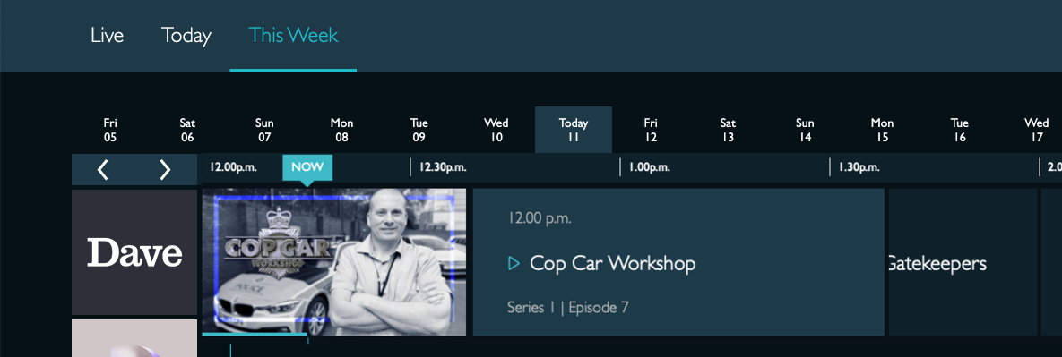
Upon approaching this projects it was highlighted by the stakeholder that this was a tactical change. With this in mind I analysed the current TV guide. By posing questions:
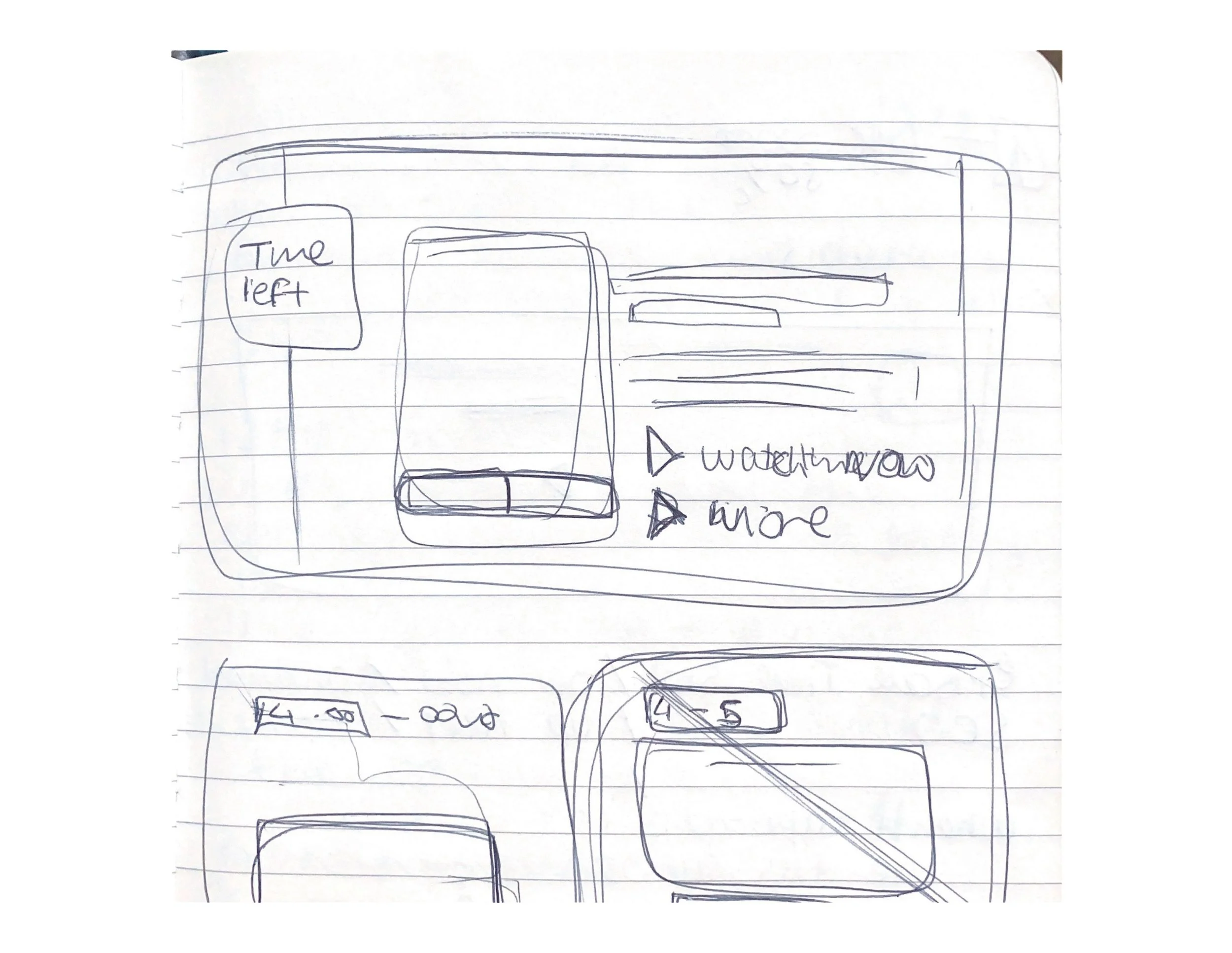
How do I see what was on drama Thursday at 4pm?
What was this show about?
How much of the show is left?
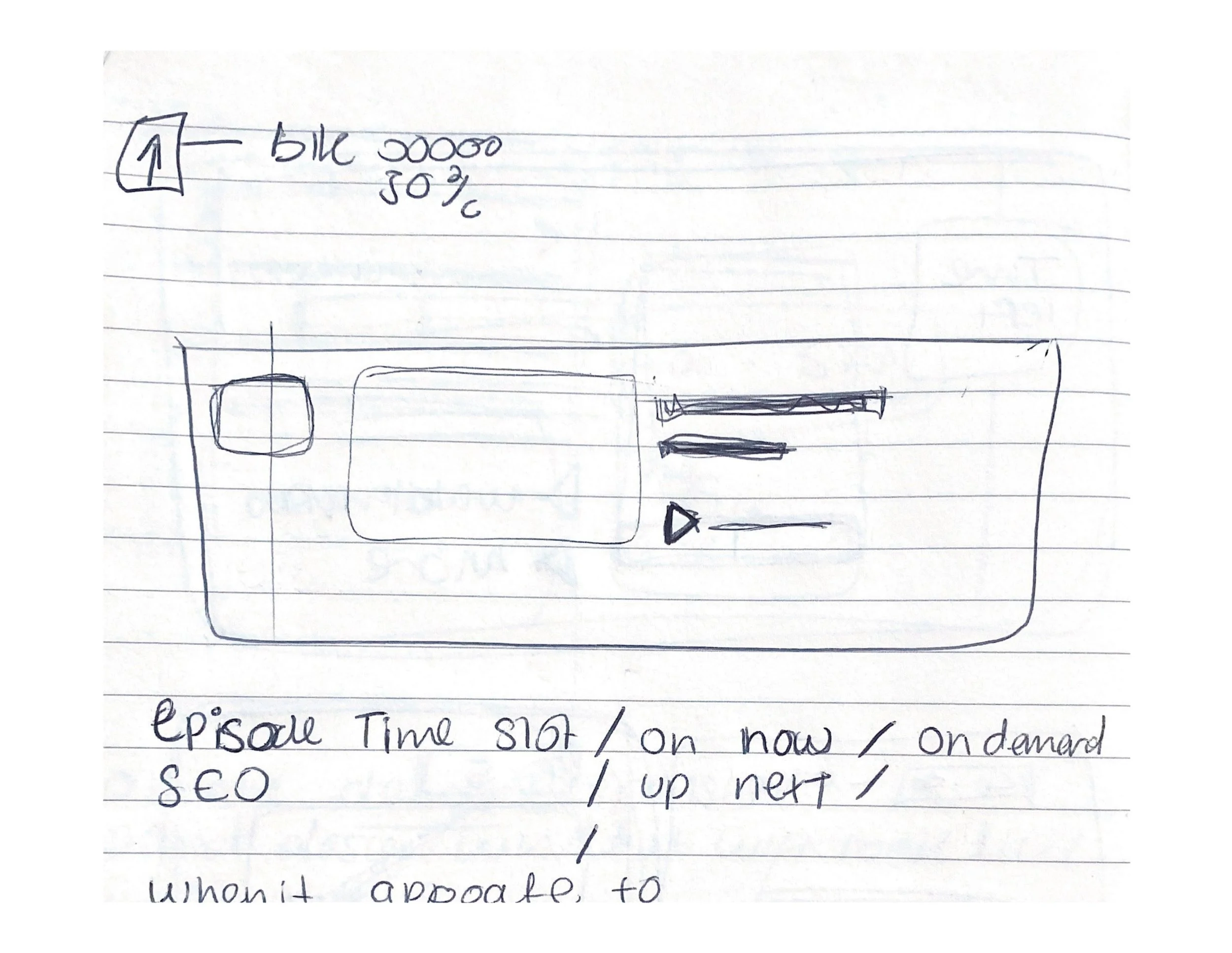
What is on now?
What is coming on next?
This investigation provided clarity to my understanding of this feature. I found it was outdated and not aligned with a future first product because the experience of this TV guide was overwhelming. If anything, the changes would encourage the use of the tv guide.
Competitor Analysis
MY 5
+ Channel brands colours. Shows the user which channel they are view.
+ Both date and channel brands are fixed when strolling.
+ The user has the control to strolls down through the timeline.
+ What is currently playing is shown at the top of the list when you first arrive on the page.
+ CTA to return to then to the top
- Doesn’t allow the user to go back 7 days and 7 days forward.
- No indication of the current day.
- Playback CTA was slightly unclear on which content is available on VOD.
IPlayer
+ The Current day is clearly stated. (TODAY 08)
+ Full week behind and ahead.
+ Channel brands colours. Shows the user which channel they are view.
+ Both date and channel brands are fixed when strolling.
+ Episodes that are on on VOD are greyed out
+ Episodes that are available are accessible this is indicated through the play icon.
+ Categories ie documentary, lifestyle and entertainment
- No thumbnail image on smallest breakpoint.
Insights:
The competitors arrange the programme through rows, creating unbroken horizontal lines of negative space between the programme on the timeline. We could use the Gestalt principle of continuity to drive users to scroll through the timeline while providing an opportunity for users to watch on-demand content on UKTV Play.
Define and Develop
During this phase, I had to consolidate information to solve the challenge of providing users with relevant information and eliminate features that overloaded the interface.
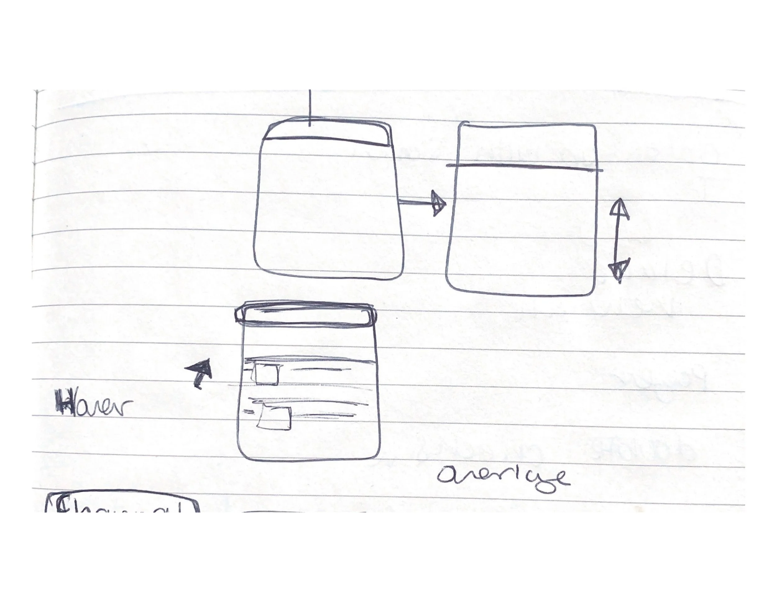
There was a clash between the main navigation and the channel selector on the TV guide. The developers noticed this during the build of these designs. This issue interfered with how the user used the main navigation.
When discussing possible solutions with the developers I referred to my research, it became clear that the behaviour of the main navigation needed to be customised to get the best experience from the tv guide. Similarly, in the competitor analysis the date and channel selector is fixed to the top when scrolling so that this feature is more functional for the user.
Delivery
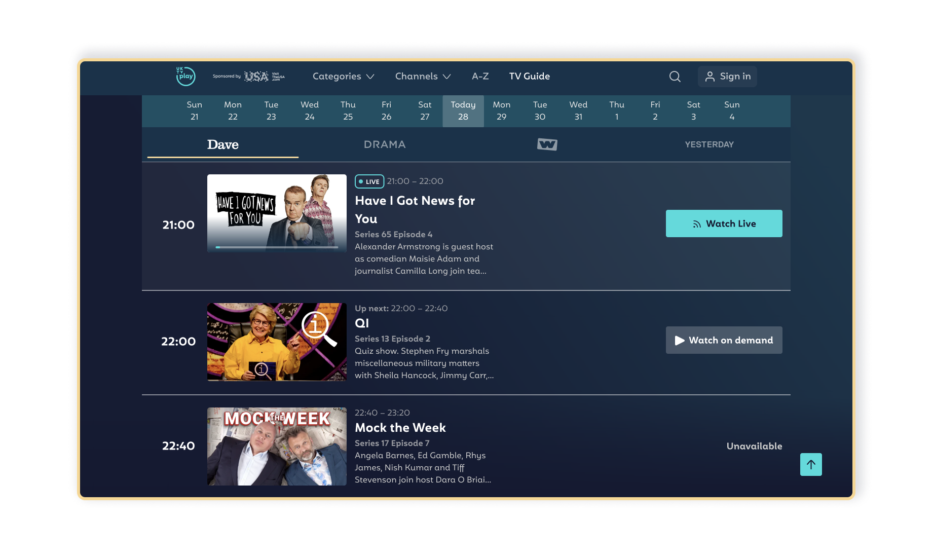
These tactical revisions clearly distinguish how content is accessed through VOD Playback, linear viewing at a time on broadcast and simulcast. But most importantly, it directed channel site users to VOD and improved the user experience.
Below are the final outcome. https://uktvplay.co.uk/tv-guide/dave


Retro
In retrospect, I would consider how the TV guide interacts with the product as a whole. Also, I would explore how this TV guide is a tool for merging lineal and VOD viewers.
Rebrand
When UKTV Play rebranded, it was adapted to be more accessible for the user. This included adding a link to the TV guide in the navigation.
